
Table of Contents
Curated Careers
Thursday Tidbits
How to write a CTA?
A Skeleton of Landing Page (PDF)
5 Bootstrap Template links (Free to Download)
Colours decide how you are perceived
AI Arena:
Top AI tools of the week
E-commerce Planning GPT
If this was forwarded to you, consider joining our community through this link.
💼 Curated Careers 💼
Senior Marketing Manager, Customer Advocacy at Blue Yonder
📍 Full-time, Remote (US)
💸 $120K / year
⚒️ Brief: Amplify the success of our customers through creative storytelling that brings their challenges and winning strategies to life.
Marketing Associate, Social Media at Apartment List
📍 Full-time, Remote
💸 $70K / year
⚒️ Brief: Own our social media presence, from content strategy to day-to-day execution, establishing a robust presence on Instagram, YouTube Shorts, TikTok, and Pinterest
💎 Thursday Tidbits 💎
➡️ How to CTA ?
When we speak about landing pages, we expect some action from the visitor.
If the visitor takes the action → they become a lead!💸
CTAs (Call-to-Action) work in favour of making it easier.
These are buttons with embedded link to the next step of conversion.
The headline makes a promise, the CTA delivers it.
~ Okay, I get it Deep. CTAs push the user to convert. Can I go back to my life?
No, wait. There’s more to it. Which is…
How to write a good CTA that boosts conversion?
That has a simple answer —

Don’t write CTA, rather switch to CTV!
CTV? Call to Value.
CTAs are good, but they are cliche. It’s been a popular free advice by many experts!
“Use action-oriented buttons"
But no-brainer action prompts don’t work anymore.
In an A/B test by Unbounce, they tested with a simple change —
from: ‘Start your free 30-day trial’
to: ‘Start my free 30-day trial’
and saw a 90% increase in click-through rates.

Giphy
Why?
The first one seems like someone’s trying to control your actions.
While the second one sounds more like a benefit by choice.
After going through hundreds of CTA…
I say ‘value phrases’ convert more than ‘action phrases’.
Value comes into light by —
Delivering on the promise:
Headline → Write like a professional copywriter in seconds
CTA → Start magic-writing
Offering something new:
CTA (Meh!) → Start free trial
CTA (Yeah!) → Claim 1000 free credits
Tackling user’s objection to your previous CTA
(why did they not click the first CTA?)CTA 1 → Try free
Objection → “I bet it asks for my credit card”
(Tackled) CTA 2→ Try free (No CC required)

And if you can do that, your CTAs will start working out for you!
Moving on…
Next up, we have created this skeleton for your next landing page. It Makes it easy to convert your expectations to designers or web developers.

And, here are 5 really attractive landing page templates. All of them are free to download.
Category | Download Page Link |
|---|---|
B2B | |
Mobile app | |
E-commerce (Product) | |
Services/ Agency | |
Corporate/ Agency |
If you didn’t check out the last issue, where I wrote out a step-by-step guide on landing pages, click here.
➡️Here’s a question for you to recall the last issue.
Answer it right and you get a shoutout in the next newsletter! (To be featured, please enter your Name and LinkedIn profile link in the additional feedback space once you choose any of the options above.)
In other thoughts…
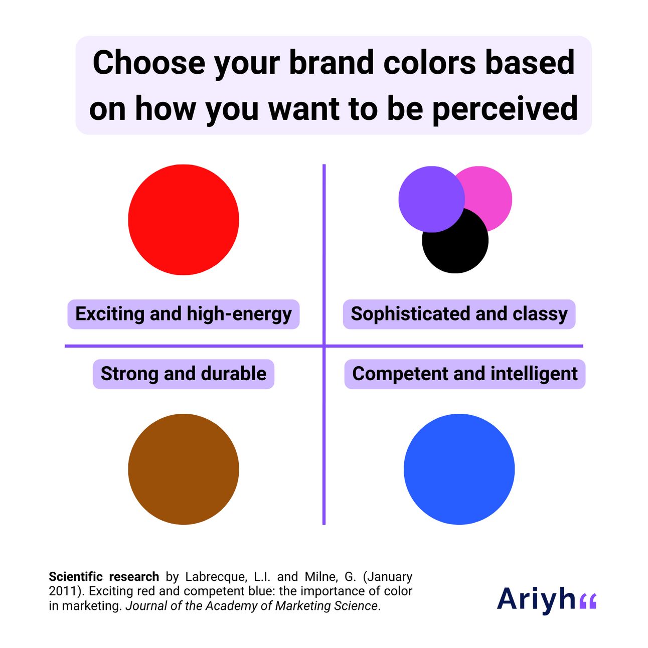
Red is exciting, blue is competent — Source Ariyh
As a part of 4 experiments, researchers found that:
Compared to a grayscale (black and white) logo, when a colour logo is used, people feel a 53% stronger brand personality.
People looking for a durable, strong, or well-built product were 3.32 times more likely to want to buy a condom when it was advertised in high-saturation red.
In contrast, people looking for classy, attractive, or refined products were 2.63 times more likely to want to buy an item with low saturation, purple shades, and a high-value (pastel) design.
🧠 Reason: Colors trigger unconscious associations in people's minds and decide how they perceive a brand:
Red is considered exciting.
Blue is considered competent.
Black, pink, and purple are associated with sophistication.
Orange is considered unsophisticated.
Brown is considered strong, durable, and outdoorsy.
We feel more excitement when viewing colours that are more saturated, while pastel colours have the opposite effect, calming.
🤖 AI Arena 🤖
⚙️Top AI Tools of the Week🔥
Pixite - Offers AI-driven custom clothing design and printing
Motion - AI that intelligently plans your day, schedules meetings, and builds the perfect to-do list
Hypotenuse AI - Instantly transform keywords into blog articles, eCommerce content, and more.
➡️ E-Commerce Planning GPT
This prompt guides you through setting up an e-commerce business as per your product category and the platform name (Brand Name) you choose.
Copy and paste the below prompt into your chat GPT and go through the steps.
Prompt:

Guide me through creating an E-commerce Platform. Assume I'm a complete beginner. Start by explaining how to identify and analyze the target market for [Product Category]. Then, walk me through choosing and registering a domain name for [Platform Name], and selecting a web hosting provider. Next, explain how to design the website layout and structure, including selecting and setting up an E-commerce CMS. Provide detailed instructions on integrating payment gateways, setting up product pages, and managing inventory. Finally, explain how to implement marketing strategies and publish the website online, including configuring domain settings and ensuring website security.

Product Category - [Insert here]

Platform Name - [Insert here]
Thanks,
Deep Kakkad, your marketer friend.


