
Table of Contents
Curated Careers
Trends and Tidbits:
What’s Wrong With Your Landing Page?
Step-By-Step Guide to Landing Page
1- Have a Killer Headline
2- Simplify the Conversion Process
3- Logic + Emotion = Decision
4- Value Proposition
5- Simplify the design
If this was forwarded to you, consider joining our community through this link.
Use AI as Your Personal Assistant
Ready to embrace a new era of task delegation?
HubSpot’s highly anticipated AI Task Delegation Playbook is your key to supercharging your productivity and saving precious time.
Learn how to integrate AI technology into your processes, allowing you to optimize resource allocation and maximize output with precision and ease.
💼 Curated Careers 💼
Digital Optimization Specialist at PETA
📍 Full-time, Remote (US)💸 $58K / year
⚒️ Brief: To optimize PETA-entity websites, and other digital products, for performance through data analysis, web analytics, reporting, personalization, and website testing.
Marketing Coordinator at PickFu
📍 Full-time, Remote
⚒️ Brief: Support the marketing team in daily administrative tasks, such as scheduling & coordinating podcasts, webinars, partner events, etc.
Senior Social Media Strategist at National Debt Relief
📍 Part-time, Remote💸 $43.75 Hourly
⚒️ Brief: Develop, execute, and optimize paid social media campaigns on Meta and other platforms
Apply
💎 Trendy Tidbits 💎
➡️ What’s Wrong With Your Landing Page?
Picture this:
You’re on a dating app. (Oops, are we talking about landing pages? 😕)
You’ve swiped through countless profiles.
And finally, someone catches your eye 😍
Their profile picture is stunning, the bio is witty, and their interests match yours.
Excitedly, you decide to send a message. (Butterflies in your stomach😉)
You see that double-tick turning blue!
And then… a pause
something heartbreaking happens.
You don’t get a reply (not even the next day).
~ And then you wonder, but where was my mistake?
The message! Buddy, the message.
Maybe out of excitement (or lack of experience), you wrote something that didn’t sound good to the other person.
Maybe the intent didn’t match what seemed from your profile.
The point here is —
The same goes for a landing page. It is nothing less than a proposal to your Tinder match. Hence, you must craft it with all your attention.
It is a lot about figuring out what they expect & delivering up to that.
We discussed last Tuesday about understanding their behaviour on your web pages and optimizing your website to match it. Which was Behavioural Analytics.
Now, it is the time to learn how to…
➡️Craft a Perfect Landing Page
1) Have a Killer headline
Your headline is like the hook of a song.
It needs to grab attention. How?
By being clear, concise, and conveying the main benefit of your offer.
It sounds simple, which it is, but we overcomplicate it.

“Turn messy thoughts into actionable notes” → Clear, concise, converts benefit.
Plus, it rhymes 🤤
A question: which one do you like better?
"Contact Us Today!"
"Get Your Free Consultation Now!"
Well, Unbounce went from option 1 to option 2, increasing their conversion rate by 30%. You know why. The micro-copy on the CTA is more benefit-driven.
Why? It tells the visitor what they gain.
Another thing to think about here is…
→ How to list your features?
Use more bullet points. Always. it keeps it easy on the eye.
Just like how Hubspot does it.
Keep descriptions short and sweet, and focus on key benefits. Nobody likes reading long paragraphs, especially on a screen.
Highlight your unique selling propositions (USPs).
Speak their language.
2) Simplify the Conversion Process
Minimize the steps needed for conversion. AKA reduce the friction.
Let them slide in smoothly.

Giphy
Every extra click or form field is an opportunity for them to leave.
Think about Amazon’s “1-Click Ordering”. It’s all about simplicity.
Don’t make them fill out an endless form. Create short forms with only necessary fields.
→ Just the email address will be enough if you are running an email list.
Just like our login page.

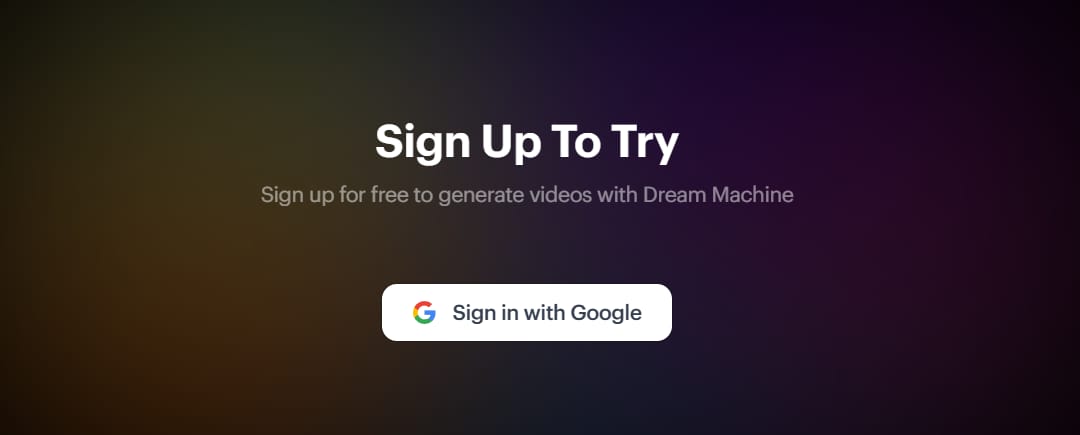
And sometimes you don’t even need forms. Just like Luma Labs.

You can simply ask to sign in with Google.
3) Logic + Emotion = Decision
Decisions are driven by logic. And emotion.
Sometimes it’s more emotion than logic.
Sometimes, it’s just emotion.
So - target their heart as much as their brain.
Use testimonials, trust badges, and emotionally resonating visuals to build trust.
Appeal to their emotions while backing them with logical reasoning.
Step 1: Identify emotional triggers.
Step 2: List logical reassurances.
Step 3: Align both for a seamless message.
4) Value Proposition
Do you have an extra edge over all others?
How does your product solve the problem?
What makes you the best choice in the market?
Don’t worry. You don’t have to be the best.
Because, there are cases, where it’s difficult to offer something completely different from the competitors…
so, it’s also about how uniquely you serve your offerings.
You be you - and that’s enough.
But we fail to recognize and convey who we are. Now, that’d be a problem.
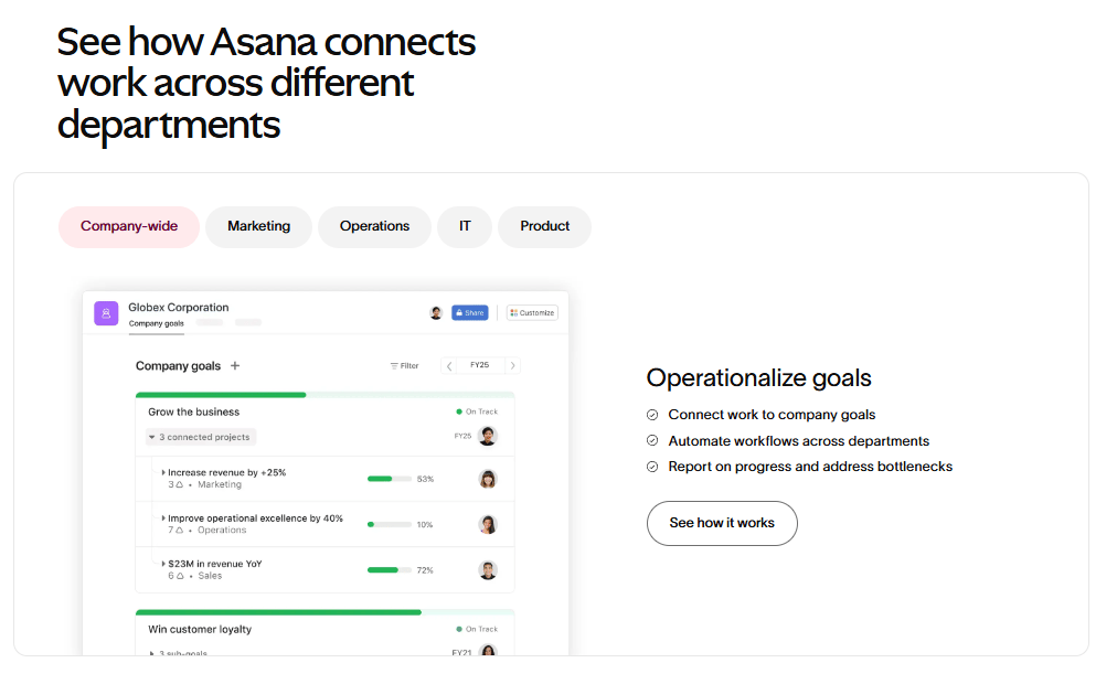
Case study — Take Asana, for example.
On the surface, it might seem like just another project management tool, not so different from competitors like Trello or Monday.com.
→ But Asana carves out its niche by focusing on connection and ease.
Their slogan is "Work works better with Asana".
Catchy, isn’t it? Also strategic.
It speaks directly to those who feel overwhelmed by the complexity of task management, especially when scaling up.
The note here is - They are not just selling a product. They’re selling a seamless, effortless experience that makes your work life feel connected and cohesive.
While Trello focuses on productivity. And they don’t emphasize the experience in the same way. So, even if the offerings seem similar, Asana stands out by serving it in a different way - which is the point.
The next thing is the clarity of your proposition.
It shouldn’t be confusing. Do this-
Place the proposition front and centre → High visibility.
Limit the choices → Faster decision-making
Keep your choices for pricing limited to 3 at max.
5) Simplify the design
You should remember — “Less is more” when it’s about landing page design.
Avoid making it overly complicated and let the user skim through the page smoothly. To make it smooth for them, here are three hierarchies to follow—
Informational hierarchy
Only 16% of website visitors read every word. The rest simply skim.
So — your value proposition, core benefits and reasons to believe should go in the headings and sub-headings.
Structural hierarchy
You must structure the information in a way that comprehension is easier even when the user is just skimming.
Visual hierarchy
→ Highlight certain elements of the page more than others using colour, contrast, and saturation. Just like in the image below.
The 5 steps that we explained so far are enough to craft a killer landing page.
But, whenever you talk about landing page audit or conversion rate optimization. There are two unspoken pre-requisites —
1) Loading Speed Optimization —
In short, if your landing page load time doesn’t pass Google’s Core Vitals report and their PageSpeed Insights test, you’ve got work to do.
Why? Because the probability of a bounce increases by 32% if the page load speed goes from one second to 3 seconds.
2) Mobile-friendly design —
There’s a very high chance that the majority of your website traffic is coming in from mobile phones compared to a desktop. Believe it or not. Especially if you are B2C or e-commerce.
→ Must make the landing page responsive to any screen size.
→ Create touch-friendly CTAs
Well, that marks a wrap for today.
I hope now you don’t get seen-zoned by your crush (and your web traffic).
Keep tuned for the Thursday Tidbits, where we will discuss more on CTAs and share super useful templates for Landing page optimization.
Cheers 🍻on completing step 3 of becoming a champion in Conversion Rate Optimization(CRO). Now, you’re almost a champ!🔥
If you didn’t check out the last issue, where I explained WTH is Behavioural Analytics, click here.
Look out for the next issue, where we discuss [A/B Testing]- The Right Way
AI & ChatGPT Mini Crash Course - Eliminate workplace burnout & save 16+ hours every week. Learn 20+ AI tools, prompting techniques & hacks for free.

Thanks,
Deep Kakkad, your marketer friend.


